- 1. Why tile colour matters more than pattern
- 2. Best tiles colour for living room
- 3. Grey tiles for the living room
- 4. Wall and floor tiles colour combination for the living room
- 5. Vastu colour guide for living room floors by direction
- 6. How to choose the right floor tile colour
- 7. See these colours in person at our Bengaluru showroom
- 8. Frequently asked questions
27 August 2026
Best Tiles Colour for the Living Room: What Indian Homeowners Pick in 2026

The living room floor colour sets the mood for the entire home. It is the largest uninterrupted surface your guests see when they walk in, and the backdrop against which your furniture, curtains, and decor sit every day. Choosing the best tiles color for living room spaces involves balancing what looks good, what works with your furniture, what suits your room's size and light, and for many Indian homeowners, what aligns with Vastu Shastra. This guide covers every popular colour option, from grey and beige to white and charcoal, with Vastu guidance and practical wall and floor tiles color combination advice to help you decide with confidence.
Why tile colour matters more than pattern
In a living room, the floor colour does 80% of the visual work. A bold pattern on the wrong base colour will always feel off, while the right colour in a plain tile will always feel right. This is why settling the colour question first, before you look at marble veining, wood grain, or geometric patterns, saves you from hours of second-guessing at the showroom.
The best color for floor tiles depends on three things: your room's natural light (how much and from which direction), the size of the room (compact or spacious), and the existing furniture and wall colours you plan to keep.
Best tiles colour for living room
Grey tiles for the living room
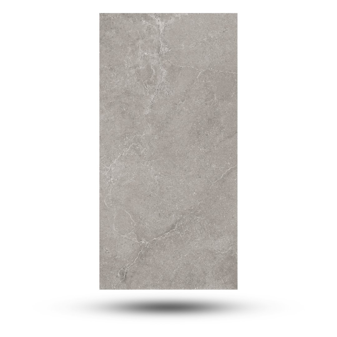
Grey is the most popular modern floor tile colour in Indian apartments and for good reason. Grey tiles living room floors work because grey is the most neutral and forgiving base you can choose.
Light grey suits small to medium living rooms (under 200 sq ft). A satin or matte light grey floor reflects enough light to keep the room feeling open, hides dust and footmarks better than white, and pairs with every furniture finish: wooden, metal, upholstered, or lacquered.
Mid grey with a cement or concrete-look texture is trending in open-plan apartments where the living room flows into the dining area and kitchen. The subtle tonal variation in cement-look grey tiles hides daily wear and gives the floor a grounded, industrial-modern feel.
Dark grey or charcoal works in large, well-lit living rooms (200 sq ft and above) with high ceilings. Dark floors make light furniture stand out dramatically and create a sophisticated, anchored atmosphere. Avoid in compact or dimly lit rooms where it can make the space feel smaller.
Vastu note: Grey is considered neutral in Vastu and is generally acceptable for living room floors. Light grey is preferred over dark grey for homes following Vastu guidelines, as lighter tones are associated with openness and positive energy flow.
Browse grey and neutral floor tiles for the living area.
Beige and cream tiles for the living room
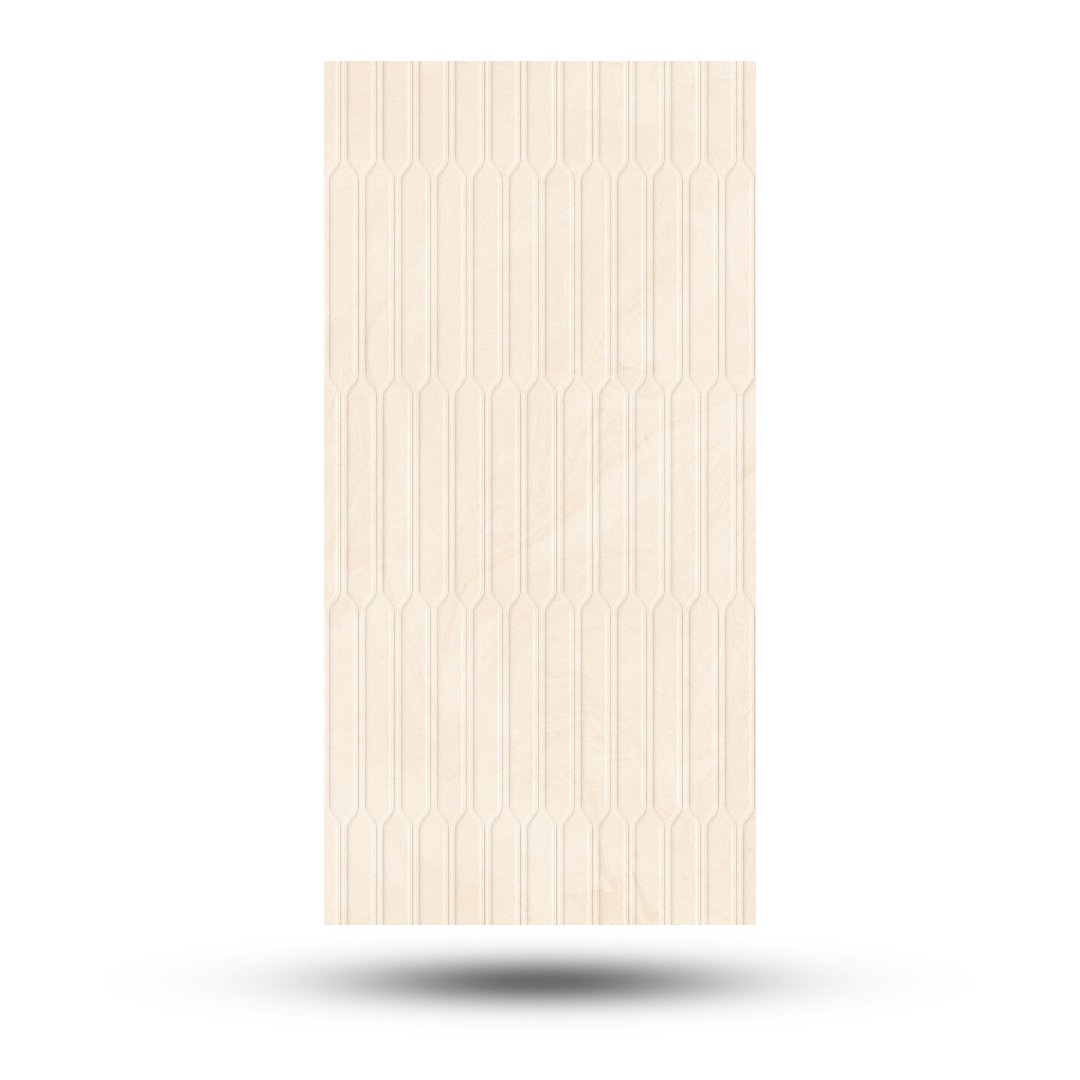
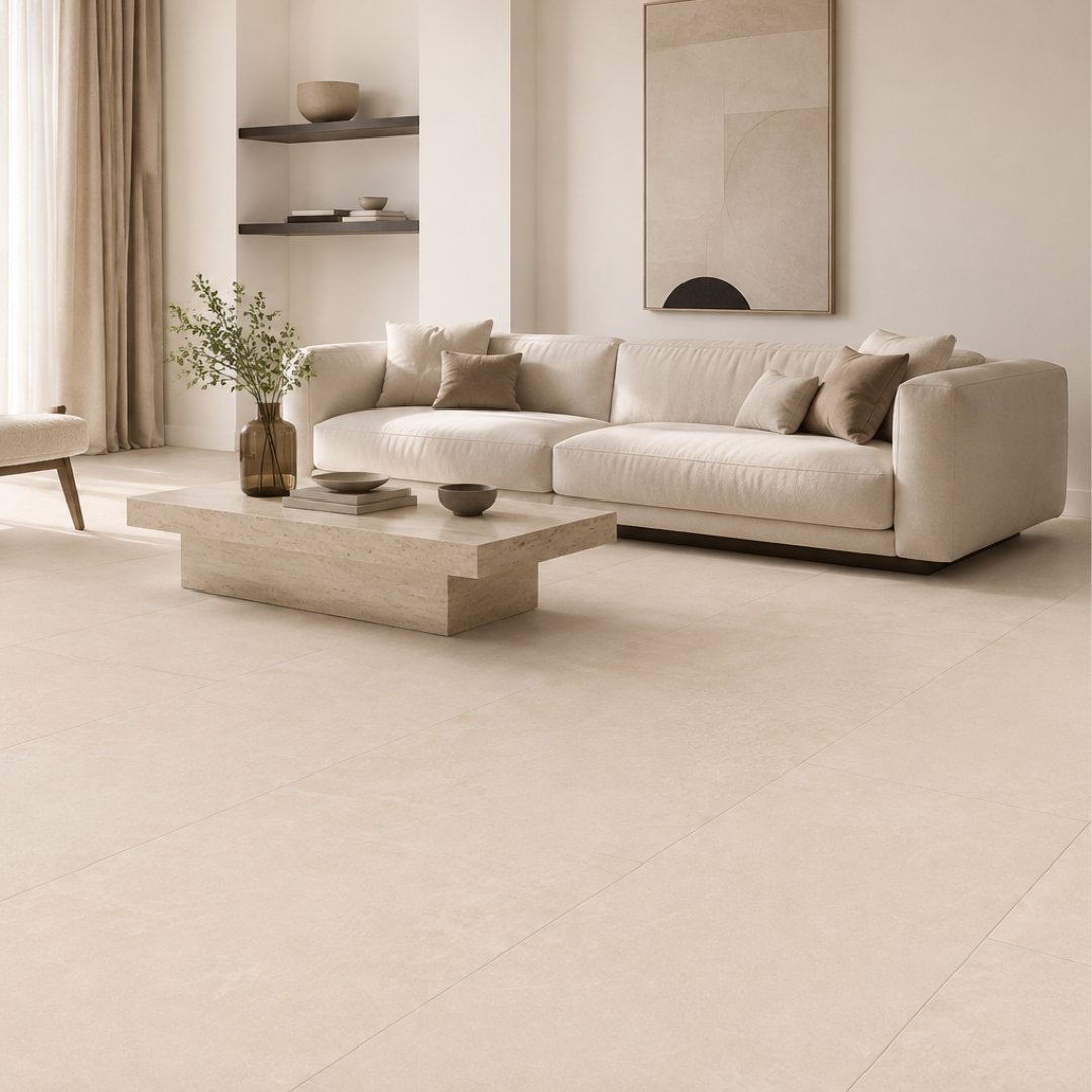
Beige tiles for living room floors are the classic Indian choice and remain the most popular in traditionally styled homes. Warm beige, cream, and ivory tones create a welcoming, unhurried atmosphere that suits dark wood furniture, brass accents, and rich-coloured soft furnishings.
Warm beige marble-look is the go-to for traditional and semi-modern Indian living rooms. Botticino and Crema Marfil marble-look vitrified tiles bring natural warmth without the maintenance of real marble.
Ivory and cream are the lightest end of the warm spectrum. They open up compact rooms like light grey does, but with a warmer undertone that suits homes with warm-toned LED lighting and wooden furniture.
Vastu note: Beige, cream, and light yellow are among the most Vastu-favourable colours for living room floors, particularly for homes with a northeast or east-facing living room. These tones are associated with warmth, stability, and positive energy in Vastu Shastra.
Browse marble and stone-look floor tiles in beige and cream tones.
White floor tiles for the living room
White floor tiles living room installations create the brightest, most spacious-feeling base possible. White works exceptionally well in small apartments, narrow living rooms, and any space with limited natural light.
Statuario white marble-look (white base with grey veining) is the most popular white floor tile in India. The veining adds visual interest without introducing colour, so the floor stays bright while avoiding the "too clinical" feel of plain solid white.
Plain white in large format (600x1200) gives the cleanest, most minimal look. Best in modern, minimalist-styled homes with neutral or monochrome furniture.
The practical concern: white floors show dust, hair, and footmarks more than any other colour. If your living room sees heavy daily traffic, a white with subtle veining or a very light grey will give you 90% of the brightness with far less visible daily grime.
Vastu note: White is considered auspicious and suitable for living rooms in all directions. It represents purity and openness and is one of the safest Vastu-compliant floor choices.
Brown and wooden tones
Wood-look tiles in teak, oak, or walnut tones bring organic warmth to living rooms, especially in open-plan layouts where the floor continues from the hall into the dining area.
Light teak opens up the room while still feeling warmer than grey or white. Works well with both modern and traditional furniture.
Dark walnut adds richness and drama but needs a large, well-lit room (same rule as dark grey). Pairs beautifully with light walls and cream or white upholstery.
Vastu note: Brown and earthy wood tones are Vastu-friendly for south and southwest-facing living rooms. They represent earth energy and stability.
Browse wooden-look floor tiles for the living area.
Colours to approach with caution
Some tile colours are beautiful in the right setting but risky as a default living room floor choice.
Black: dramatic but absorbs light, shows dust heavily, and makes all but the largest rooms feel smaller. Use as an accent (a border, a fireplace surround, or a small feature area), not a full floor.
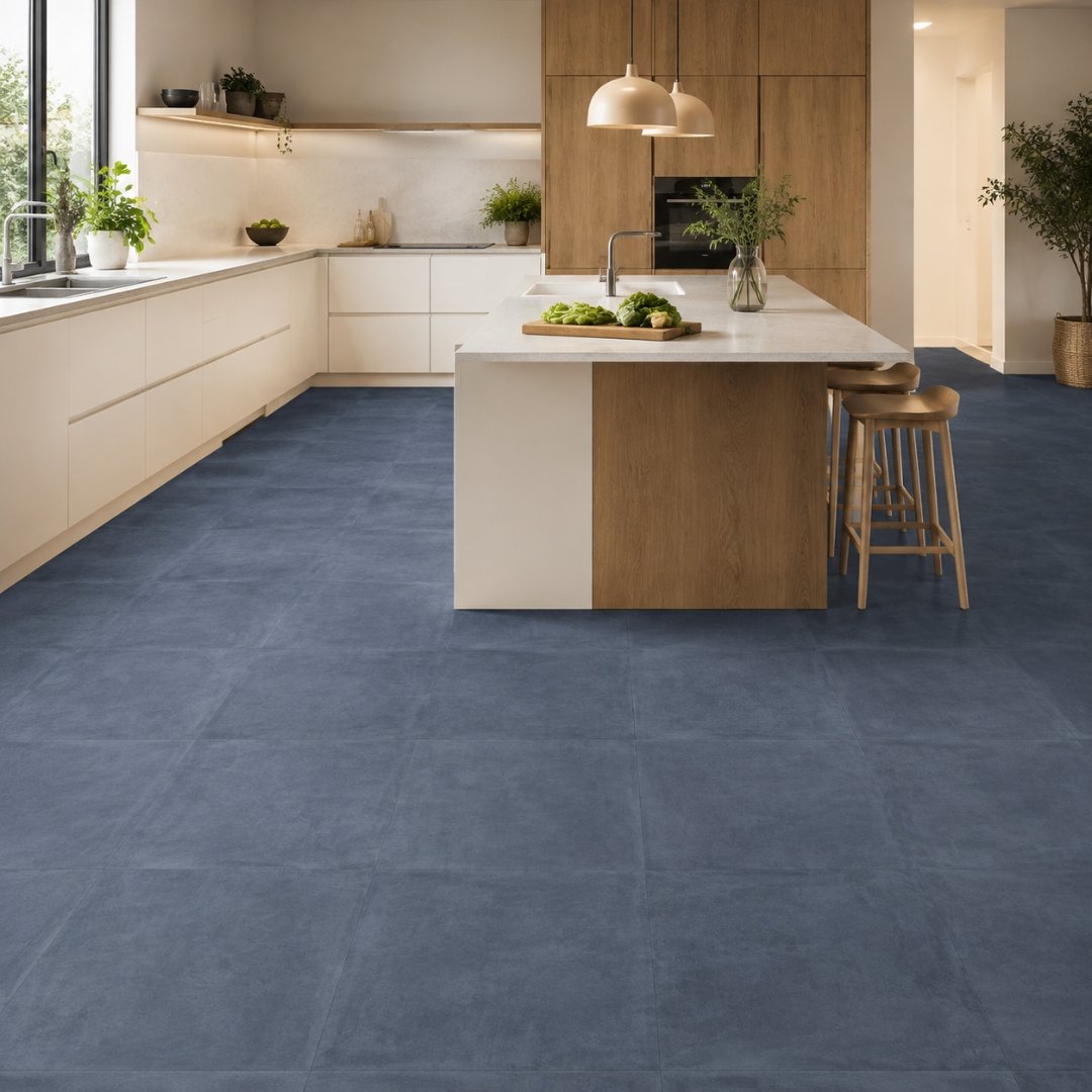
Bold colours (blue, green, terracotta): These work in accent walls or small feature zones but rarely as a full living room floor. A blue Moroccan floor in a compact living room is a commitment you may regret in three years. Keep bold colour for rugs (which you can change) rather than floors (which you cannot).
Very dark brown: can make a room feel like a cave if the walls and furniture are also in dark tones. Only works when paired with very light walls and lots of natural light.
Wall and floor tiles colour combination for the living room
Getting the floor colour right is half the job. The other half is pairing it with the right wall treatment. Here are the tiles color combination for living room pairings that work consistently.
Grey floor + white or off-white walls
The safest modern combination. The cool floor grounds the room while the light walls keep it bright and open. Works with every furniture style.
Beige floor + warm cream walls
The classic Indian combination for traditional and semi-modern homes. Warm on warm creates a cosy, inviting atmosphere.
White floor + light grey accent wall
Reverses the typical formula. The white floor does the brightening, and a single highlighter accent wall in textured grey adds depth without darkening the room.
Wood-look floor + stone-look wall behind the TV
Mixing textures rather than colours. A teak-tone floor with a stone pattern wall behind the TV unit creates a layered, natural look that suits contemporary Indian interiors.
Dark floor + all-white walls and ceiling
The only way to make a dark charcoal or walnut floor work in a room under 200 sq ft. Maximum contrast keeps the room from feeling closed in.
The 60-30-10 rule for tile colours
60% quiet base (your floor and most walls), 30% supporting tone (remaining walls or an accent), 10% statement (a feature wall tile, a rug, or a furniture piece). This ratio keeps any living room balanced regardless of which colours you choose.
Vastu colour guide for living room floors by direction
|
Living Room Direction |
Best Floor Tile Colours |
Colours to Avoid |
|
North-facing |
White, light blue, green |
Red, dark brown |
|
Northeast-facing |
White, cream, light yellow |
Black, dark grey |
|
East-facing |
White, green, light brown |
Dark red |
|
Southeast-facing |
Light brown, beige, orange tones |
Blue, black |
|
South-facing |
Red, brown, terracotta tones |
Blue, black |
|
Southwest-facing |
Brown, beige, earth tones |
Blue, white (pure) |
|
West-facing |
White, grey, silver tones |
Red |
|
Northwest-facing |
White, light grey, cream |
Orange, red |
The safe default across all directions: light grey, warm beige, or white marble-look. These three colours are Vastu-compatible with every room orientation and suit both modern and traditional Indian homes.
Setting up a prayer space too? Our small pooja room tiles design ideas include Vastu-friendly colours for the mandir wall.
How to choose the right floor tile colour
1. Check your room's natural light
Stand in the living room at midday and again at 7pm. Bright, well-lit rooms can handle darker tones. Dim rooms need light colours to compensate.
2. Match the furniture you plan to keep
Dark wood furniture sits best on light floors (grey, beige, white). Light or modern furniture works on both light and dark floors.
3. Consider the open-plan flow
If your living room opens into the dining area or kitchen, the floor tile colour needs to work across all three zones. A neutral (grey, beige, or wood-tone) travels across rooms better than a bold colour.
4. Small room = light colour
Rooms under 150 sq ft should default to light grey, ivory, or white. Dark floors in small rooms create a visual weight that makes the space feel cramped.
5. Order samples in pairs
Bring home your top two floor tile colours and place them on the actual living room floor, next to your furniture, in daylight and evening light. The winner becomes obvious within minutes.
For design-first inspiration, read our Hall Floor Tile Designs: 20 Looks for Indian Living Rooms.
See these colours in person at our Bengaluru showroom
Tile colour on a screen is never the same as tile colour in your hand. Screen brightness, display settings, and the absence of texture all distort what you see online. The only way to know how a grey or beige or white tile will look in your living room is to see it under real light and compare it against your furniture tones.
Our BTM Layout experience center (right next to BTM metro station) displays thousands of living room floor and wall tiles across every colour family, alongside sanitary ware, faucets and complete home hardware, so you can match your entire home's colour palette in a single visit.
Frequently asked questions
Which tile colour is best for a living room in India?
Light grey and warm beige are the two most popular and practical choices. Grey suits modern interiors and hides daily grime well. Beige suits traditional and semi-modern homes and aligns with Vastu recommendations for most room directions.
What is the best floor tile colour for a small living room?
Light colours: white, ivory, light grey, or soft beige. These reflect more light and make compact rooms feel more open. Avoid dark floors in rooms under 150 sq ft.
Which tile colour is best for living room as per Vastu?
White, cream, beige, and light grey are Vastu-compatible across all living room directions. For direction-specific guidance, see the Vastu table above. When in doubt, warm beige or white marble-look is the safest choice.
How do I match wall and floor tile colours in the living room?
Follow the 60-30-10 rule: 60% quiet base (floor + most walls in a neutral tone), 30% supporting colour (remaining walls or a soft accent), 10% statement (one feature wall or a bold decor piece). Keep the floor and walls in the same tonal family (warm + warm or cool + cool) for a cohesive look.