06 October 2026
Subway Tiles for Kitchens and Bathrooms: Layouts That Work

Subway tile is the one choice in this entire catalogue that nobody ever regrets. It will not be the most interesting wall in the house, and that is exactly the point. It is also the tile most likely to be copied from the exact station platforms it is named after, which is a stranger origin story than most people realise when they order it for a kitchen backsplash.
This guide covers where subway tile actually works, the layout patterns that change how it looks, and how to use it without the result looking like every other subway-tiled kitchen in the country.
Where the name comes from
Subway tile takes its name from the glossy white rectangular tiles used to line the original New York City subway stations in the early 1900s, chosen because the glossy surface reflected light in underground platforms and was easy to wipe clean. The proportions, roughly a 1:2 or 1:3 rectangle, became the template that every subway tile since has followed, regardless of where it is actually installed.
Where subway tile works
Kitchen backsplash
The single most common use, and for good reason. The glossy finish resists oil and turmeric, and the small, regular tile hides the switch and socket cut-outs that a kitchen backsplash always needs. See our kitchen subway tiles.
Bathroom walls
Subway tile on bathroom walls gives a clean, classic look that suits both traditional and modern bathrooms, and it is the tile most forgiving of an inexperienced tiler, since the regular shape makes layout errors less visible than an irregular pattern would. Browse our bathroom subway tiles.
Shower walls specifically
Glossy subway in a shower area reflects light in what is usually the dimmest corner of a bathroom, and the smooth glaze resists soap scum better than a textured finish.
As a background for a feature
Subway tile is often the plain surface a highlighter band or a Moroccan panel is set against, precisely because it does not compete with the feature for attention.
Layout patterns, and how each one changes the look
| Layout | Look | Where it suits |
| Running bond (brick pattern, offset by half a tile) | Classic, traditional | Most kitchens and bathrooms, the default for a reason |
| Stacked (grid, joints aligned) | Modern, clean lines | Minimal, contemporary interiors |
| Herringbone | Detailed, higher effort | Feature backsplash zones, not a full wall |
| Vertical running bond | Makes a wall feel taller | Bathrooms with low ceilings |
| Basket weave | Textured, less common | Small accent areas |
Running bond is the layout most tilers already know well, so it is also usually the fastest and cheapest to lay correctly. Herringbone and basket weave take longer and are worth the extra labour mainly on a smaller feature area rather than a whole wall.
Grout: the decision that matters more than the tile colour
Subway tile's whole character comes from the grout line, since the tile itself is usually a plain glossy colour.
- Matching grout (close to the tile colour) makes the wall read as one continuous surface, the quieter and more modern choice.
- Contrasting grout (typically dark grout with white tile) makes every tile edge visible and turns the wall into a pattern in its own right.
The grout itself is what holds up to daily wear here, and a grout joint is more porous than the glazed tile around it, which is why colour choice doubles as a maintenance decision. In a kitchen, think about maintenance before choosing contrast: dark grout hides staining better than light grout in daily use, so a contrasting dark grout is often the more practical choice behind a cooktop, not just the more dramatic one.
Colour beyond white
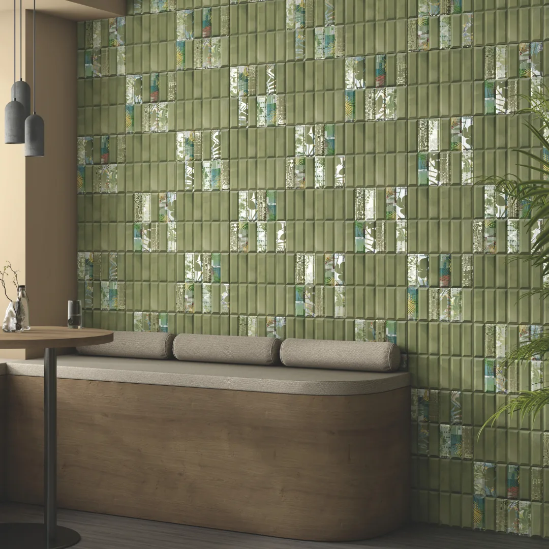
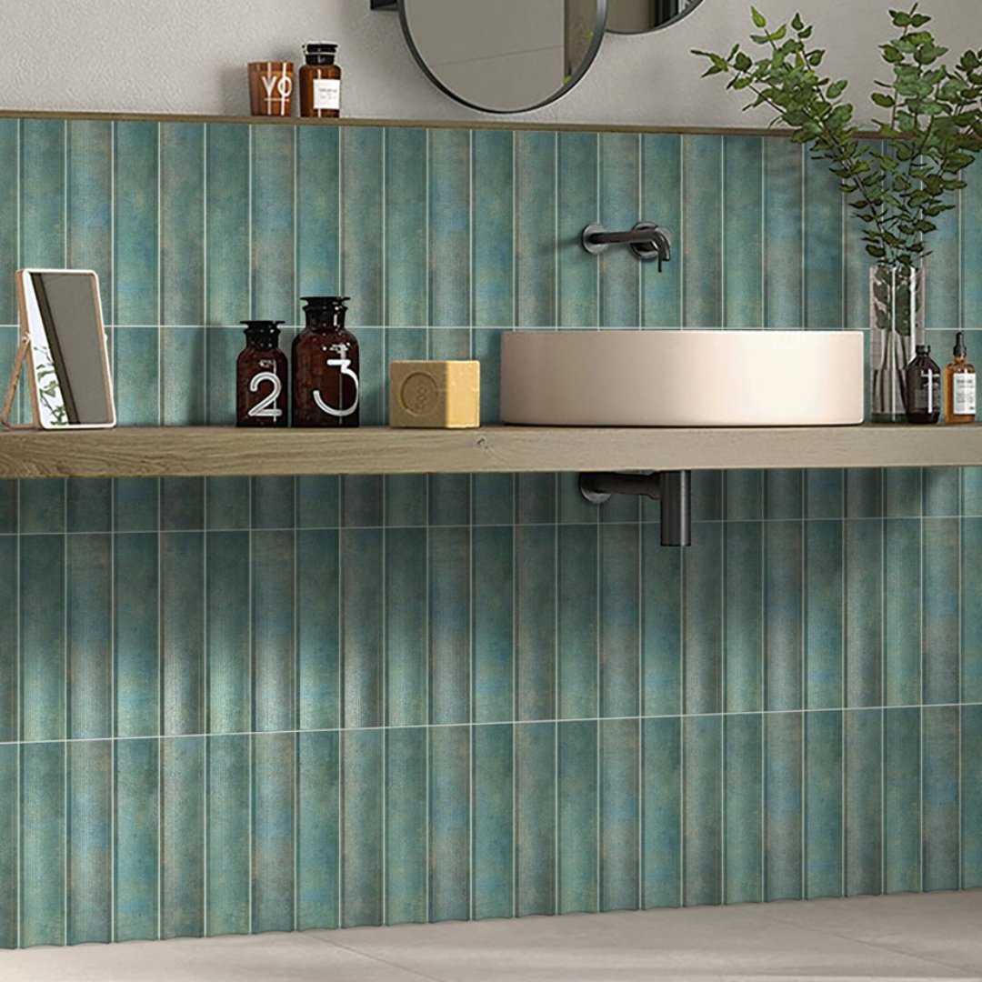
White is the original and still the most common, but subway format comes in other colours now. A pale sage, dusty blue or soft grey subway tile keeps the classic proportions while giving the kitchen or bathroom a colour anchor that plain white does not. Choose a colour that works with your counter or fittings rather than the tile alone, since subway is almost always the supporting surface, not the feature.
Common mistakes
- Choosing herringbone for a full wall without pricing the extra labour first. It takes noticeably longer to lay correctly than running bond.
- Dark grout with light-coloured tile in a humid bathroom. Grout darkens with mould over time regardless of colour, but the contrast makes any patchiness far more visible. Use epoxy grout here if budget allows.
- Vertical layout in a wide, short space. Vertical running bond is a trick for making a space feel taller, and applying it to a wide, low wall can look like a mismatch between the tile direction and the room's proportions.
- Treating subway as the only decision. Since the tile itself is plain, the layout and grout choice carry more of the design decision than they would with a patterned tile.
How to choose
- Decide the room and zone: full backsplash, full wall, or background for a feature.
- Pick running bond unless you specifically want the slower, more detailed herringbone or basket weave for a smaller accent area.
- Choose grout colour based on both look and how visible staining will be in that specific room.
- Pick a tile colour that matches your counter or fittings if you want subway to recede, or a contrast colour if you want it to anchor the space.
- Confirm quantity including the skirting if the same tile runs to the floor, using our tile sizes guide for the conversion.
See our subway tile range in person at the BTM Layout showroom, where you can hold two grout samples against the actual tile before deciding.
Frequently asked questions
What is subway tile and where does the name come from?
Subway tile is a small, glossy rectangular tile, typically in a 1:2 or 1:3 proportion, named after the tiles used in the original New York City subway stations in the early 1900s. The proportions have stayed the same template ever since, regardless of where the tile is actually used.
Is subway tile good for a kitchen backsplash?
Yes, it is one of the most practical choices available. The glossy finish wipes clean of oil and turmeric easily, and the small tile size hides switch and socket cut-outs better than a large-format tile would.
Should subway tile grout match the tile colour?
Either works, and it is a style choice. Matching grout makes the wall read as one continuous surface. Contrasting grout, often dark with a light tile, makes the individual tiles visible as a pattern and tends to hide staining better in a kitchen.
What is the best subway tile layout pattern?
Running bond, the classic offset brick pattern, is the default for good reason: it suits most rooms and is the fastest and most reliably laid pattern. Herringbone and basket weave look more detailed but take longer to lay and are better suited to a smaller feature area.
Does subway tile only come in white?
No. White is the classic and most common choice, but the same rectangular proportions are available in other colours, including pale sage, dusty blue and soft grey, for homeowners who want the classic look with a colour anchor.
Can subway tile be used on a bathroom floor?
It is a wall tile and is not typically rated for floor use. For a bathroom floor, a textured or anti-skid rated tile is the safer choice, covered in our anti-skid bathroom tiles guide.